THE MOJO AT MOFO: ARTWORK MAKES MAGIC AT GENSLER’S MORRISON & FOERSTER
Peter Webster | September 29, 2014
- PROJECT NAME: Morrison & Foerster Office
- LOCATION: New York
- FIRM: Gensler
- SQ. FT.216,000 SQF
Many separate worlds, self-obsessed and frequently combative, compose the city of New York. But three powerful spheres of influence—corporate law, commercial real estate, and contemporary art—came into unusually auspicious alignment at a Gensler project in Midtown.
The story begins with the 2009 crash, which saw developer Boston Properties abruptly halt foundation-level construction on a $1.5 billion, 38-story office tower by Skidmore, Owings & Merrill. Two years later, the mothballed project sprang back to life when San Francisco law firm Morrison & Foerster agreed to become the anchor tenant. A New York Post headline trumpeted: “Lease Saves 250 W. 55th.” Eight levels, 17 through 24, plus a basement support facility, would become a larger Manhattan outpost for 350 attorneys and support staffers at MoFo, as it’s universally known. (No obscenity intended. The moniker derives from the firm’s telex address.)
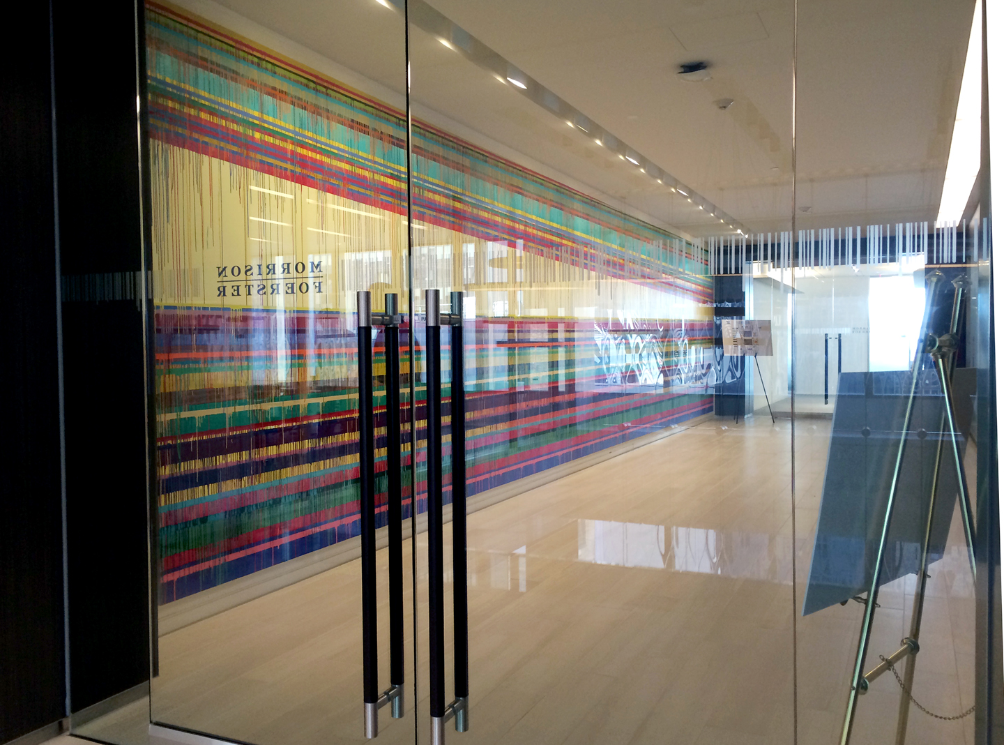
It was Gensler that brought the art world into the 216,000-square-foot project’s orbit. “With a sophisticated and soothing environment in a subtle palette—grays, whites, natural finishes—there needed to be a dramatic moment, something that people would remember,” principal Edward Wood says. “Right from the start, I knew what that could be.”
MoFo’s eight main elevator lobbies have cars on only one side, leaving the opposite wall a blank canvas. Wood envisioned filling those 42-foot-long spaces with site-specific works by a painter known for his brilliantly colorful, large abstractions. “I’d been hoping to work with Markus Linnenbrink ever since he did a temporary installation at Gensler,” Wood says. “I felt that his paintings could bring a necessary artistic grandeur to the project. But they were a strong statement, especially for a law firm.” Would MoFo go for it?
Wood familiarized the attorneys on the design committee with Linnenbrink by incorporating examples of his work into all initial renderings of the elevator lobbies—presenting the art as integral to the space rather than a piece to be added later. A visit to Linnenbrink’s studio further convinced committee members that his trademark horizontal stripes and vertical drips of resin and pigment combine the right amounts of formal rigor, meticulous craft, and expressive spontaneity to represent the law firm’s essence.
Linnenbrink conceived the commission as a single, massive work split into eight sections, each unique but related. He also initially intended to paint murals directly on the walls. Eventually, however, he decided to work on panels in his studio and assemble them on-site.
A number of strategies link the dazzling murals to the otherwise restrained interiors. Controlled splashes of color, for one: A reddish orange, prominent in the elevator lobbies, finds its way into the armchair upholstery, sofa pillows, lacquered side tables, and wool rug in the sitting area off reception.
Careful detailing and an artful mix of colors and textures modulate the rectilinear, easy-to-read interiors, influenced by the geometry of the SOM building. In reception’s double-height atrium, columns and some walls are lacquered white. Other walls are paneled in a dark gray Japanese wood or covered in polyethylene in a similar brooding shade. Blond oak-effect porcelain floor tile shifts to silvery travertine for the treads of the staircase that angles upward behind the desk.
Between the desk and the stair hovers reception’s showstopper. It’s a 20-foot-high installation of clear, colorless cast-glass panels suspended on an elaborate system of steel cable. Their rippling pattern is an aqueous version of the dia-grid visible out the windows, on Foster + Partners’s Hearst Tower. Wood notes a connection to Linnenbrink, too: “As with the paintings, an exacting, repetitive form is softened and humanized.” However, the artist in this case is actually a design firm, Joel Berman Glass Studios.
From reception, a row of four framed acrylics on paper by Linnenbrink can be glimpsed overhead, hung against polyethylene wall covering in a saturated aqua derived from his larger works. That wall belongs to a conference room not far from the café. Here, glossy gray kitchen cabinetry, a backsplash of charcoal-gray glazed brick, a white counter, and black stools and chairs play off benches upholstered in a cheery aqua-and-white floral cotton that was vinylized for durability. “It brings a note of whimsy without losing the overall calm,” Wood explains.
Much the same could be said about artwork that, cometlike, adds a streak of creative energy to a law firm’s aura of serious business. Managing partner Brett Miller, a member of the design committee, evidently agrees. “Ed Wood is a genius,” Miller proclaims. Then he speeds off, past one of the drip paintings, on his way to a high-powered meeting.