Markus Linnenbrink @ Patricia Sweetow
David M. Roth
posted 13 June 2017
Few painters working today generate as much retinal excitement as Markus Linnenbrink. With epoxy resin-on-panel paintings, multi-layered sculptures, Op-ish stripe paintings, and interior walls coated in drip-laced, wobbly stripes, the Germany-born Brooklyn artist asserts the primacy of optical sensation. With his instantly recognizable candy-stripe colors arrayed across several formats, Linnenbrink’s works compel viewers to reflect on perception as well as the ever-shifting boundaries of painting, sculpture and architecture.
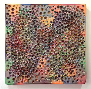
PRIMACYISNOLONGERANISSUE, 2015, epoxy resin on wood panel, 48 x 48″
This exhibition serves as a kind of condensed 10-year survey in that nearly everything in it utilizes techniques and ideas the artist developed in the early 2000s. The most prominent of these is his practice of drilling through layers of pigmented epoxy resin to expose sub-surface striations. This additive/subtractive process, which has often been likened to geologic sedimentation and archeological excavation, is really a lot closer to strip mining for the way scalloped-out holes reveal rings of paint with abstract pools at the bottom. Each stand as self-contained “compositions,” assuming we can apply such a designation to forms arrived at by pure chance.
Linnenbrink’s work has always skirted the edges of Pop and Finish Fetish. But in this show, SUNANDWATER, several works indicate a deeper move into those territories in ways that point to affinities with Ed “Big Daddy” Roth, the Southern California car customizer whose outlandish creations from the early and mid-1960s still command awe. Markus, born in 1961 and arrived on these shores in 2014, was just a knee-high when that particular yarn was spun; however as Americans well know, pop culture from that period had a peculiar knack for both time and trans-Atlantic travel, making Markus’ presumed knowledge of it (which I’ll get to later) well within the realm of possibility.
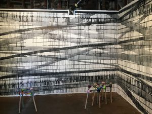
Site specific wall painting with epoxy-resin sculptures made in collaboration with architect Nick Gelpi
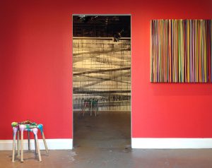
The exhibition appears in the space previously occupied by Krowswork, a new media gallery that closed in December. I barely recognized the place, so transformed is it by Markus’ color-coordinated installation. That funky little utility closet that greets visitors at the entrance? It’s now painted with intersecting diagonal lines that give the illusion of a sprawling industrial warehouse, weeping. And that blazing color palette Linnenbrink’s so famously used for painting the walls of museums, corporate lobbies and galleries (including one at this gallery’s former home at 77 Geary)? In this room it’s replaced by shades of gray and black. Activating the floor space is small group of “stools,” which I should warn you are better seen than sat on. Made in collaboration with architect Nick Gelpi, these gimpy looking constructions, with knobby corners connected by wooden dowels, suggest heat-warped molecular clusters. That motif echoes across a number of works.
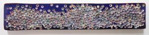
BABYBOYBOOGIEMAN, 2017, epoxy resin on wood panel, 36 x 36″
All are displayed against wall segments painted in different colors, making it tempting to ascribe psychological significance to these backdrops; but fact is: Linnenbrink has no interest in emotive expression. Nor, does he seem interested in exploring any of the issues (memory, loss, mortality, identity, politics, sexuality) that occupy contemporary painters. He does, however, draw deeply from the well of art history. One such source is Light and Space, a SoCal movement originating in the late 1950s whose practitioners (e.g. Roland Reiss, Mary Corse, Larry Bell) used synthetic industrial materials to generate metallic, iridescent, pearlescent and interference-inflected optical effects.
At this Linnenbrink’s stripe paintings excel. He makes them by allowing pigment- infused epoxy resin to drip vertically down panels and coalesce in small nodules at the edges. Each employs a huge spectrum of colors – hundreds perhaps in a single work – but they are so randomly arranged it’s difficult to detect or tease out meaningful patterns or relationships. Yet fugitive patterns of shadow and light do emerge, and it’s on these that viewers will likely dwell, cataloging the variety of textures and effects employed while wondering what “logic” guided the artist’s choices.
WHATSHOULDN’TIBETODAY, 2017, epoxy resin on wood panel, 18 x 96″
The resin-on-panel paintings, with their drilled-out craters, elicit a similar kind of wonderment. Their pockmarked surfaces, suggestive of bullet-riddled road signs, are best appreciated for their allover character, a look that fuses the pulsating quality psychedelic light shows with the “Radiances” and “Presences” of Richard Poussette-Dart (circa 1968 to 1973). The key difference between these and the drip paintings is accessibility: The holes, which have the gloss and patterning of antique marbles, are wide-open for inspection, making it easy to be captivated by the congealed puddles, formed in cavities where the artist’s drill bit stirred molten liquid into swirling patterns. Those in WHATSHOULDN’TIBETODAY are particularly dazzling.
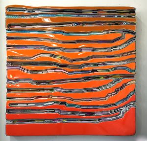
WEALLMADEOUTOFWATER, 2017, epoxy resin on wood panel, 48 x 48″
Indications of new paths the artist’s forged show up in four paintings in which Linnenbrink used a router to slice through expanses of paint. In these, large islands of clear-coated pigment run uninterrupted, while the layers exposed below appear as longitudinal and/or diagonal channels — like rabbit warrens viewed in cross section. It’s here that the Finish Fetish side of Linnenbrink gets full vent, with one work in particular, WEALLMADEOUTOFWATER, recollecting with dead-on accuracy, the color of Ed Roth’s Orange Crate, a 1932 Ford Sedan he retooled into an auto show prizewinner capable of hitting 140 mph. Nothing I’ve ever seen matches that color so precisely.
In citing this likeness, I don’t mean to imply that Linnenbrink makes facile or fast-read paintings. He clearly doesn’t. But neither are they deep. What they are mostly is deep fun of an extraordinarily high order.
# # #
Markus Linnenbrink: “SUNANDWATER” @ Patricia Sweetow Gallery through July 1, 2017.
About the author:
David M. Roth is the editor and publisher of Squarecylinder.